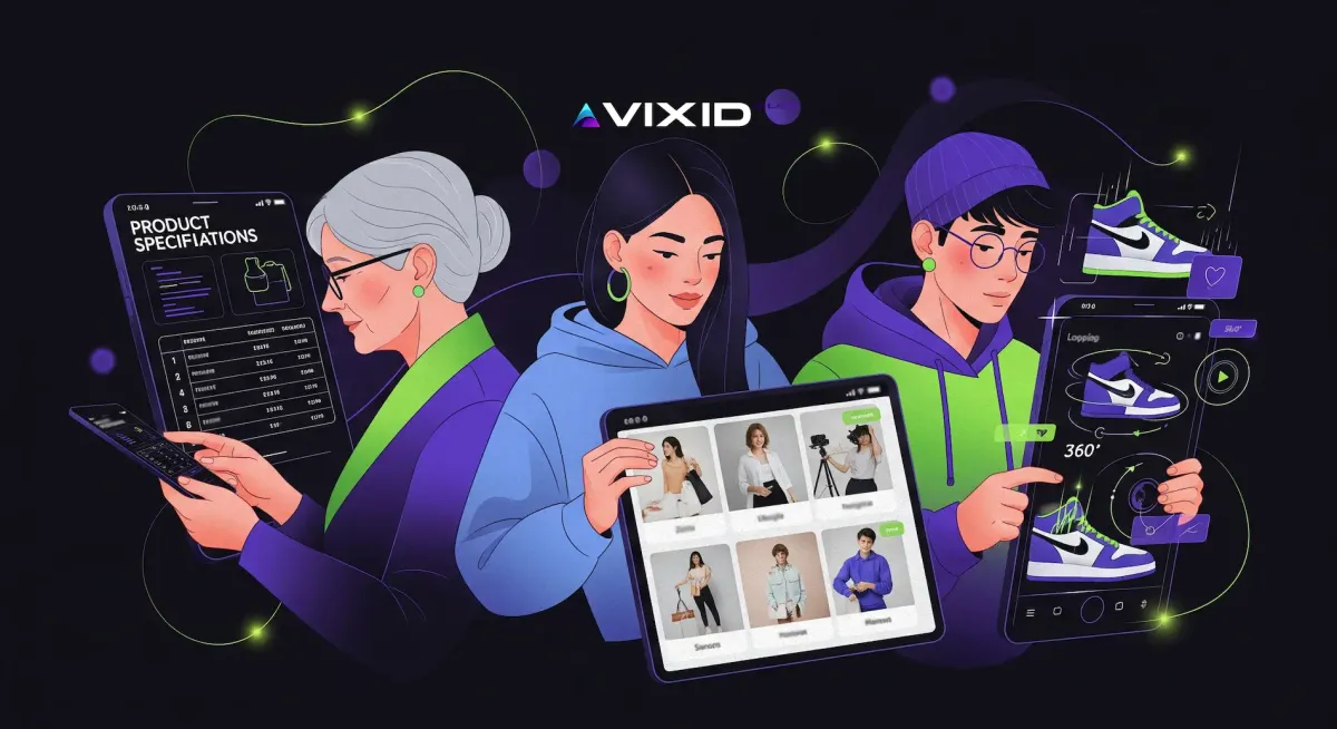
Generational design shifts: how audiences reshape the way we build e-commerce

At Vixid Labs, we often find ourselves explaining a simple truth to clients: without a clearly segmented target audience, there will be no sales. Every generation speaks its own language, and design has to respect that. It’s not just about colors or fonts — it’s about how people consume information, what they trust, and what kind of experience feels natural to them.
It might sound obvious, but I repeat this in almost every strategy session: even the biggest brand on the planet, Coca-Cola, doesn’t appeal to everyone. And you are not Coca-Cola. So why would you assume your product or service fits absolutely everyone? This kind of blind confidence has sunk more businesses than poor technology ever did.
We’ve seen companies pour money into beautiful websites that speak the wrong language to the wrong people. A text-heavy site aimed at Gen Z will simply be ignored. A TikTok-style video experience shown to a 55-year-old buyer can feel confusing or even untrustworthy. Your brand has to know who it is talking to — otherwise the best design in the world won’t save you.
This is why segmentation is not just a marketing exercise; it’s the foundation of good design. Understanding the generational shifts in content consumption is what separates a store that quietly dies after launch from one that grows into a lasting brand.
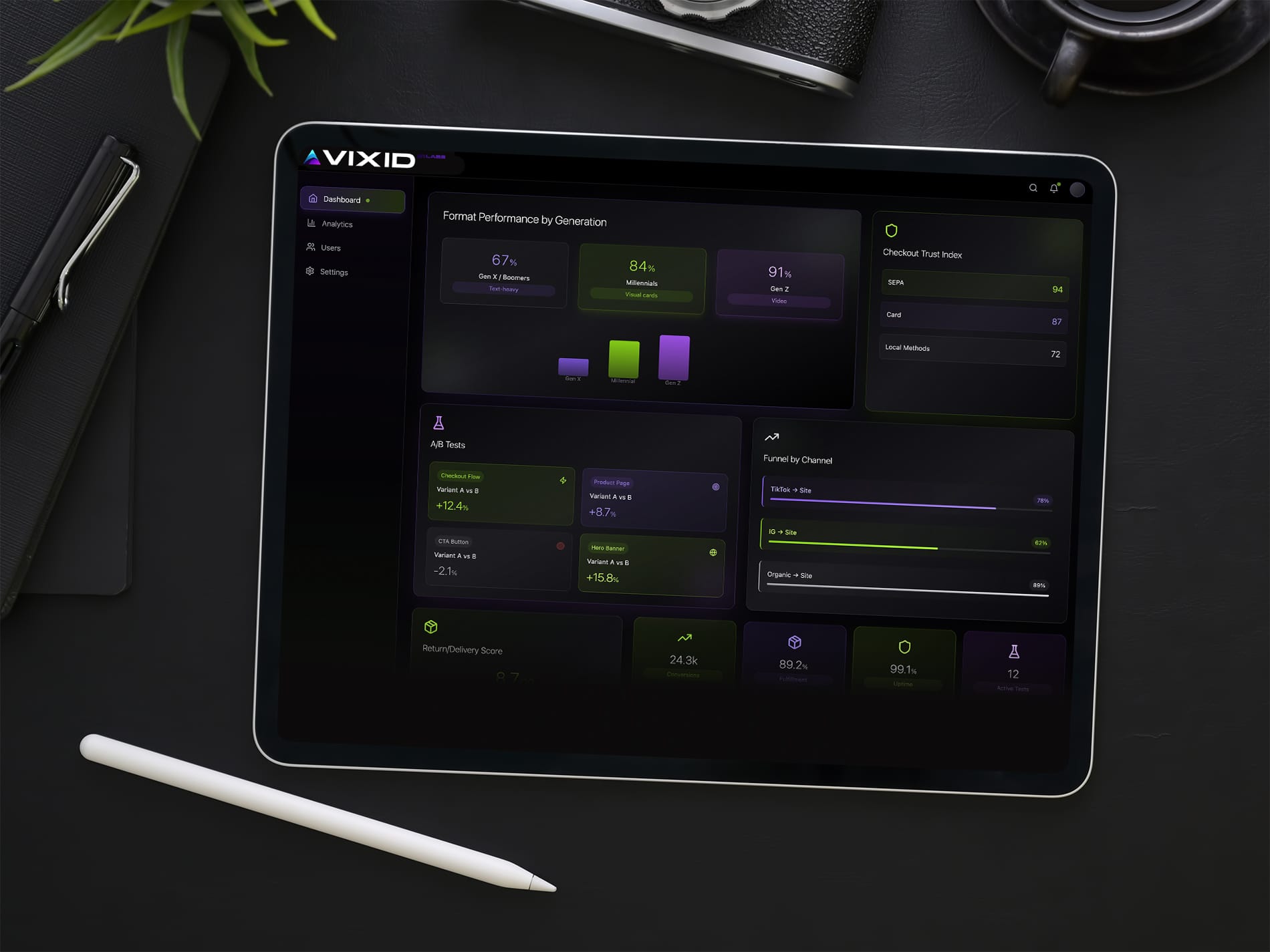
Older audiences still read
For older audiences, trust is built through words — not slogans. They don’t mind reading when the text respects their time and intelligence. Give them the full picture: what the product is made of, where and by whom it’s produced, how it’s supposed to be used, what can go wrong if it’s misused, how it’s maintained, and how long it’s expected to last. This isn’t “extra copy”; it’s the core of the purchase decision. Materials, composition, dimensions, tolerances, compatibility lists, care instructions, certifications (CE, OEKO-TEX, FSC), warranty terms, country of origin, manufacturing partner names — the more concrete and verifiable the information, the safer the choice feels.

Design-wise, this audience rewards clarity over novelty. Clean typography at a comfortable size, stable layouts without jumping elements, high-contrast color combinations, and predictable navigation all reduce cognitive load. Put the essential facts above the fold: price with VAT status clearly stated, delivery windows with reliable carriers, return policy in plain language, and a visible link to invoices or SEPA/bank transfer if they prefer traditional payment flows. If your product requires choosing a size or configuration, guide them: a size helper next to the selector, a short, human explanation of fit (not just a chart), and a discreet “How to measure” modal with photos. Good microcopy anticipates the next step: next to “Add to cart” you calmly answer “When will it arrive?”, next to “Select size” you answer “What if it doesn’t fit?”, next to “Materials” you answer “How do I care for it?”. That is what “design predicting the next move” looks like in practice.
Avoid performative minimalism that hides the facts. Collapsible sections are fine, but the labels must be explicit (“Materials & Certifications”, “Care & Safety”, “Warranty & Returns”), and the most decisive detail — like material composition or VAT — shouldn’t be buried. If a product has a story (artisan workshop in Spain, a 30-year supplier in Portugal, a certified plant in Germany), name it and link to verification where possible. This audience still values provenance; it signals that you’re not hand-waving.
In checkout, keep friction low and expectations precise. Show total cost with taxes early, offer reliable delivery options (not just the cheapest), and provide traditional payment methods alongside cards — SEPA, invoice on request for B2B, even cash on delivery where it’s culturally normal. Don’t surprise them with currency switches or last-second add-ons. A confirmation page that restates the essentials — what they bought, how to reach support, when it ships, and how to initiate a return — is more persuasive than any upsell carousel.
If you want a simple test: could a careful buyer print your product page and feel they have enough information to decide? If the answer is yes, you’re speaking their language. If the answer is no, the design is still serving the brand, not the buyer.
Millennials scroll for visuals
Millennials grew up during the shift from static web pages to endless social feeds. Their default mode of consuming content is visual, quick, and relational. They trust what feels authentic, not what looks overproduced. That’s why long product descriptions or heavy technical pages rarely work for them — they lose attention after a few lines. What draws them in are strong visuals, short bursts of copy, and browsing flows that echo the social platforms they spend their time on.
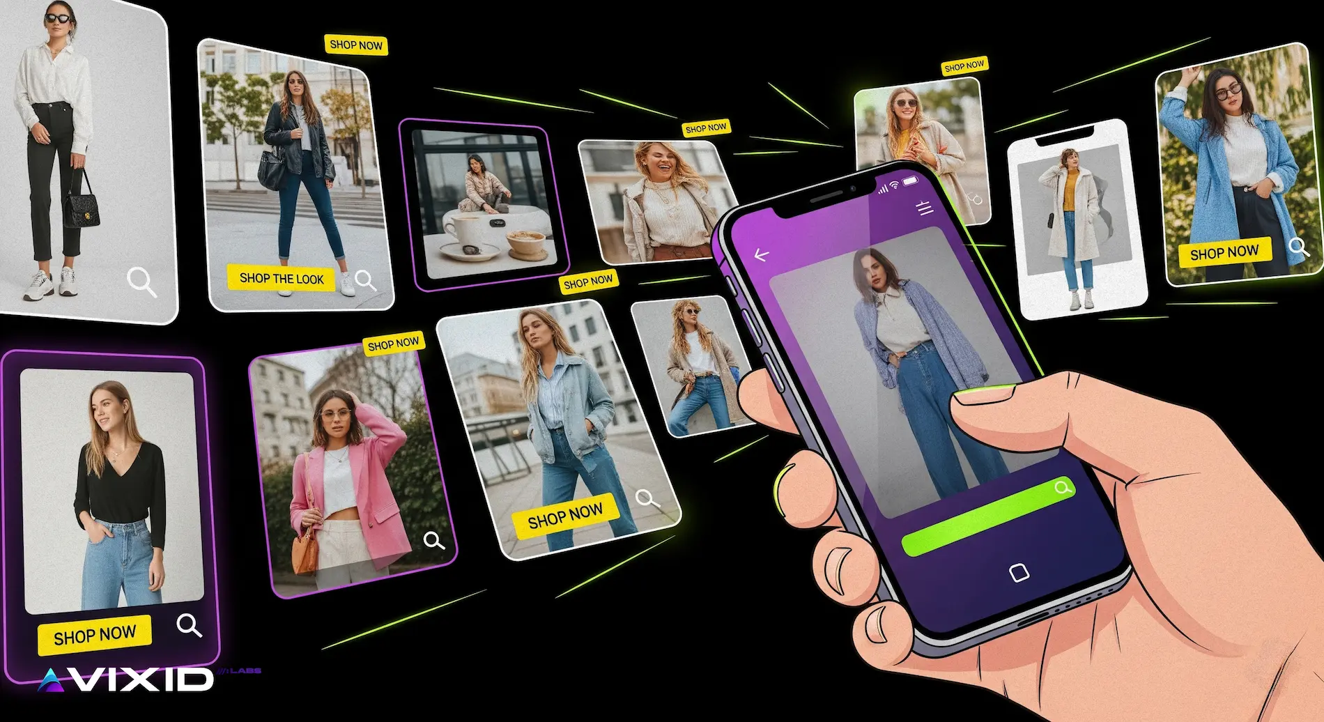
In practice, this means that for a millennial buyer, your e-commerce project should feel more like an Instagram feed than a corporate catalog. Product images carry more weight than specifications, but the images can’t look sterile. One reason brands like Zara use intentionally “bad” photos — shots that look as if a friend captured them on a phone — is because it lowers the psychological distance. The buyer doesn’t feel like they are being “sold to” but rather like they’re glimpsing how the product exists in a real life context. That relatability makes the product desirable.
This generation also expects variety and speed: swiping through a gallery of angles, lifestyle shots, and user-generated content is far more persuasive than scrolling a single static photo. Minimal explanatory text works best when it points to experience, not specs: “soft organic cotton for everyday wear” says more than “100% cotton, 180 g/m².” When text appears, it should echo the rhythm of a caption, not a manual.
To make e-commerce design comfortable for this audience, don’t overexplain upfront — let visuals tell the story. Instead of a 500-word product page, craft a journey: visual cards that highlight the product in context, short lines that frame the mood, and trust signals (delivery time, return policy, sustainability badge) woven into the flow where they expect to see them. Keep the energy light, scrolling smooth, and information snackable. They will still check details before purchase, but they arrive there through images first, words second.
The mistake many brands make is assuming that polished equals premium. For millennials, too much polish can backfire — it feels distant, corporate, even suspicious. A slightly imperfect photo, a casual tone in a caption, a quick behind-the-scenes video — these are signals of honesty. The design task here is not just to present a product, but to stage it in a way that makes the buyer think, “I can see myself in this.” That sense of relatability is the true conversion driver.
Gen Z wants motion and sound
Gen Z has grown up inside a world where video is the default medium. TikTok, YouTube Shorts, Instagram Reels — these are not side channels, they’re the environment where their attention lives. Static product images and long paragraphs feel like relics from another era. For this audience, shopping isn’t about “reading product details”; it’s about experiencing the product in motion, with sound, angles, and mood packed into a few seconds.
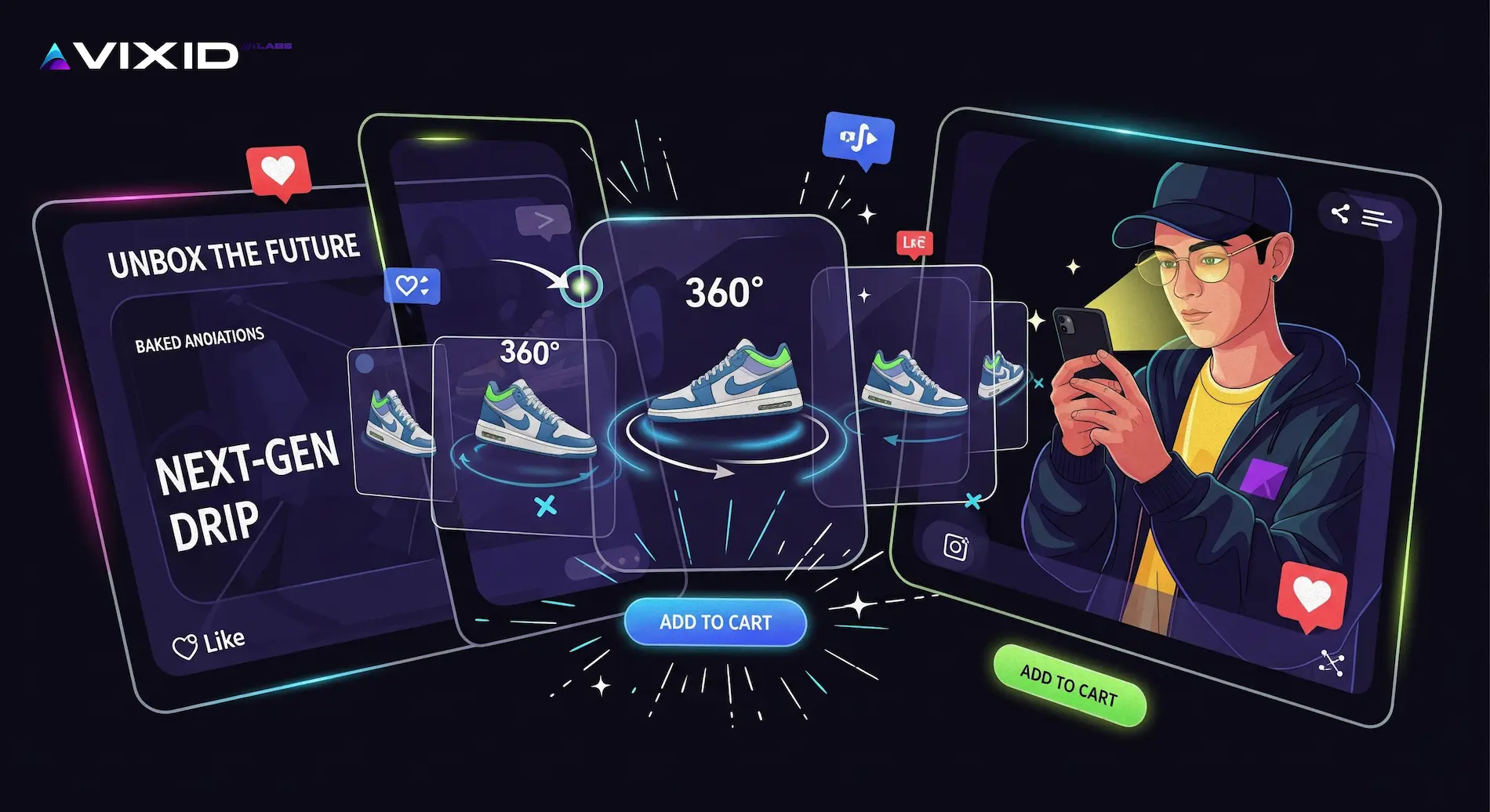
That doesn’t mean they’re superficial. It means their sense of trust and connection is built differently: through dynamic cues, through interaction, through the rhythm of video. A Gen Z shopper will often decide in the first five seconds whether a product feels right — not because they’re careless, but because they’re used to streams where every swipe is a new story.
For e-commerce design, the implication is clear: if your product page looks frozen, you’ve already lost them. They expect movement: a 360° spin of the shoe, a quick cut video showing how the jacket looks in daylight and nightlife, a clip of someone actually using the gadget. Layer in music or subtle sound design, and suddenly the page speaks their language. Even micro-animations — a hover effect, a smooth scroll, a playful transition — reinforce that sense of responsiveness and modernity.
The brands that succeed here are the ones that let the product behave like content. Think of how TikTok ads blend into the feed: fast cuts, captions baked into the video, a vibe rather than a polished pitch. For e-commerce, this means less “catalog presentation” and more “immersive micro-story.” Show how the product feels in real life, in multiple contexts, with energy.
And here’s the key: Gen Z expects interaction. They don’t want to just scroll; they want to explore. Swipeable galleries, quick polls (“Which color fits you best?”), AR try-ons, or even gamified previews — these aren’t gimmicks, they’re signals that the brand understands their mode of engagement. If your store can echo the energy of their native apps, you’ve earned not just attention but loyalty.
The challenge is balance. Too much movement without clarity can overwhelm. The art is in designing a flow where the dynamic draws them in, and the essential facts (price, availability, shipping, returns) are revealed at the exact moment they’re needed. If older audiences want all the details upfront, Gen Z wants them unlocked naturally, as they interact. That’s how you respect their habits without losing business fundamentals.
Last but not least
It’s tempting, after reading about generational differences, to think you’ve cracked the code: tailor the site to Boomers one way, to Millennials another, to Gen Z in yet another, and you’re done. But this is where most businesses go wrong. Marketing strategy is never that linear. It is a layered science, and design for e-commerce sits right at its intersection with human behavior.
Yes, each generation speaks its own design language — but in real purchase journeys, audiences overlap. That pair of sneakers a teenager desires on TikTok? The purchase may be made by a millennial parent or even a grandparent who has never opened TikTok in their life. A site that feels natural to Gen Z — full of motion, music, and interactivity — might alienate the very people holding the credit card. The opposite scenario happens just as often: products that resonate with older buyers are frequently gifted by their millennial children, who discover them on a platform that rewards quick, visual storytelling.
This is why e-commerce design is not just about aesthetics. It is about compromise, orchestration, and anticipating the invisible links between audiences. You can’t assume that the person who falls in love with the product is the same as the person who completes the checkout. You can’t assume the touchpoint that sparks desire is the same as the channel that closes the sale. Multichannel flows complicate the picture further: the ad that plants the seed might live on TikTok, but the transaction might happen in a physical store, or on a desktop site where trust is measured by how confidently the checkout handles a bank transfer.
These scenarios sound obvious once they’re spelled out — yet they remain invisible until you’ve lived through them in practice. At Vixid Labs, we’ve spent decades watching these patterns repeat, and what experience teaches us is humility. No single rulebook covers all situations, because real people never behave like textbook personas. What makes the difference is a willingness to listen, to test, and to build systems that can adapt to complex, layered realities.
So before you decide you’ve “figured out your audience,” take a step back. Make sure the details align across the pyramid: that the careful Boomer can find the exact material of those sneakers, that the millennial parent feels safe typing in their card details, and that the Gen Z teenager experiences the excitement of the product the way they expect it. That’s not guesswork — that’s strategy. And it’s the kind of strategy that requires professionals who know how to design not just for one generation, but for the interplay between them.
Conclusion
good design is about being present — attentive, curious, open. I’ve seen it in small stories, like the woman with a glass of red wine scrolling her phone, hesitating before a click. Those moments remind us: the answers are out there if we listen. As entrepreneurs, we need to absorb, to learn, to surround ourselves with diverse professionals who challenge our blind spots. We test, we run A/B experiments, we make mistakes — and we grow through them. The path forward in e-commerce is never flat, it’s layered and complex. And that’s the beauty of it: working across those layers with empathy and precision is what turns a store into a brand, and a brand into a lasting presence.